Redesigning Rite Aid's website with a user‑centered approach
Website · Retail Pharmacy
Overview
The UX team set out to shift Rite Aid's digital strategy from business-driven to customer-centric. By establishing a continuous stream of customer feedback, we enabled product teams to see where to focus and prioritize. This led to features shaped by real user needs that improved the website experience and delivered measurable business outcomes.
Opportunity
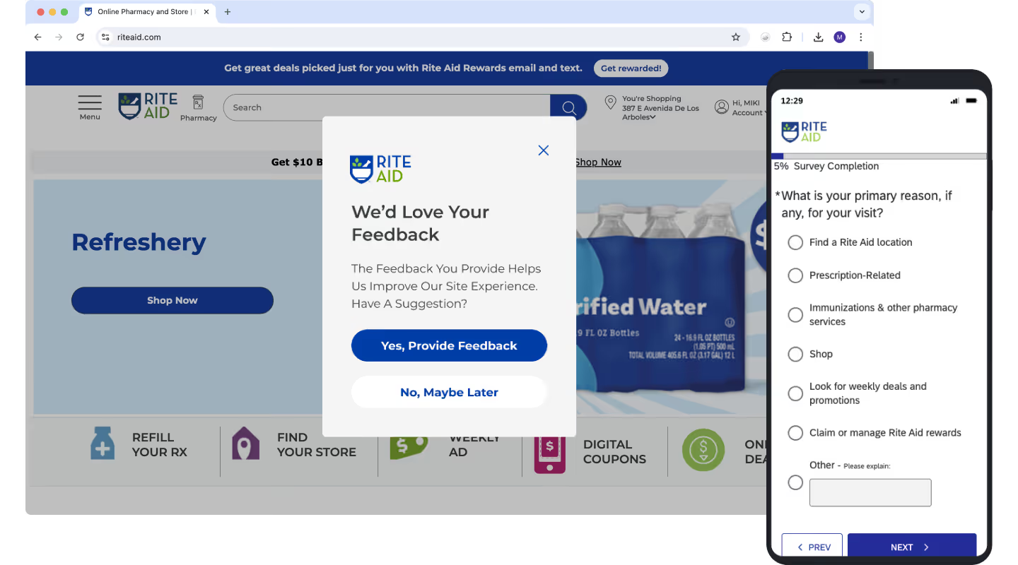
At Rite Aid, product decisions were often guided by business priorities, creating a gap in understanding how well our digital experiences met customer needs. To bridge that gap, we launched a survey on the website to capture qualitative data in order to better understand our customers and how our products are serving them. We use the insights to inform product strategy on where we can focus to address customer needs.
Results
- SUPR-Q went up 6.8% quarter over quarter for the Accounts category after redesign
- Overall NPS increased by approximately 12 points quarter over quarter
- Improvements in QA testing led to fewer bugs in production
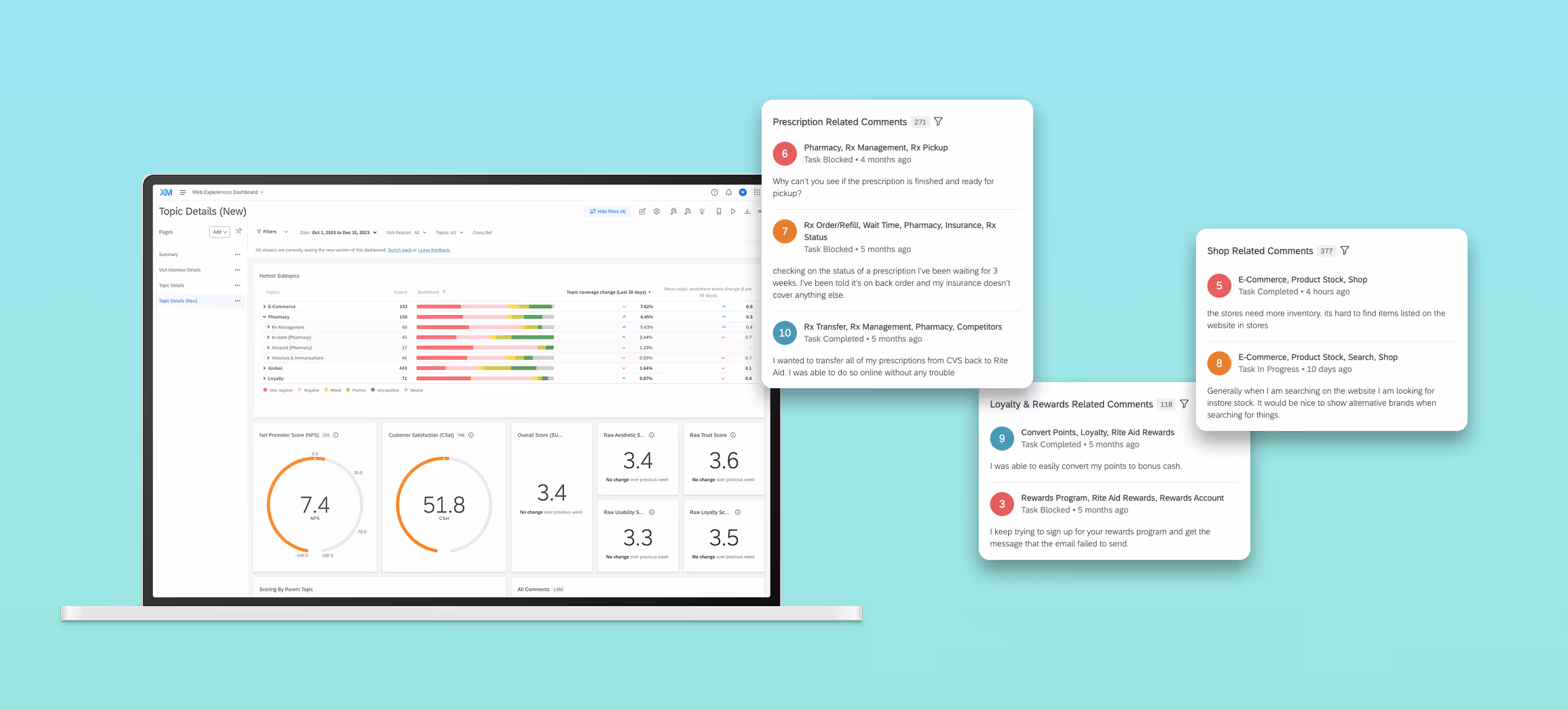
We created a dashboard that allowed product teams to easily see what topics customers were mentioning, ranked by frequency and sentiment. These insights guided product roadmaps by prioritizing the features most valuable to users and enabled designers to make more informed decisions. Using NPS and SUPR-Q to track improvements in the user experience enabled the UX team to quantify the value of our work to stakeholders.
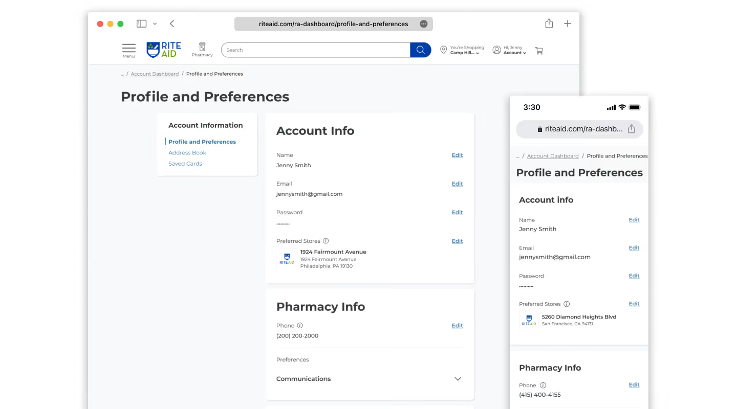
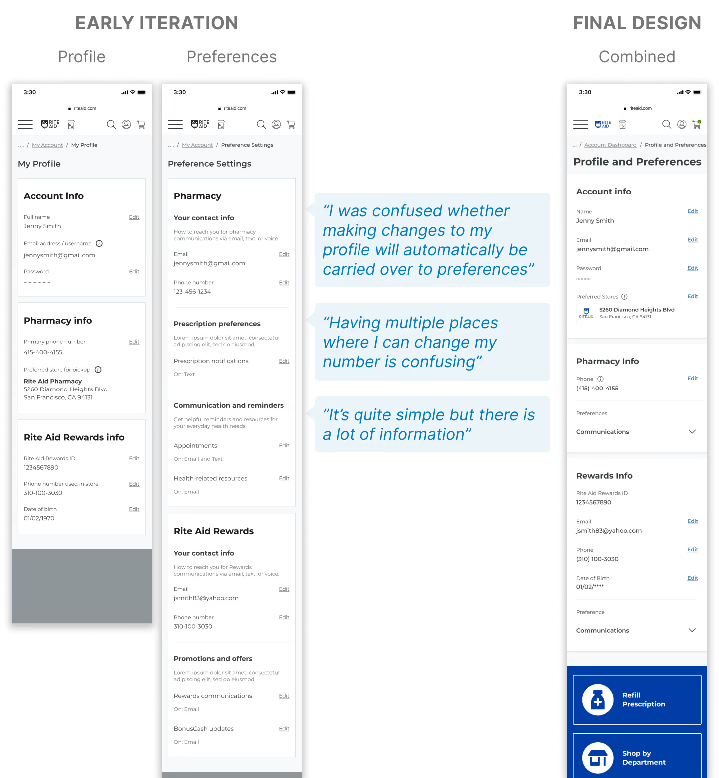
Through this effort, we were able to launch several customer-driven features. One I contributed to directly was the redesign of account settings, aimed at improving usability and expanding user preferences. Following its release, the SUPR-Q score for the 'Accounts' category rose by 6.8% quarter over quarter, showing a clear link between customer feedback and measurable improvement.
Process
Phase 1: Collect data
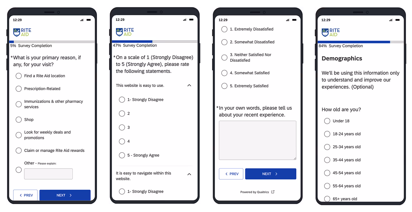
The 12-part questionnaire asked customers about their visit and used the SUPR-Q method to measure the quality of the web user experience for benchmarking. It also collected open-ended feedback and demographics information.
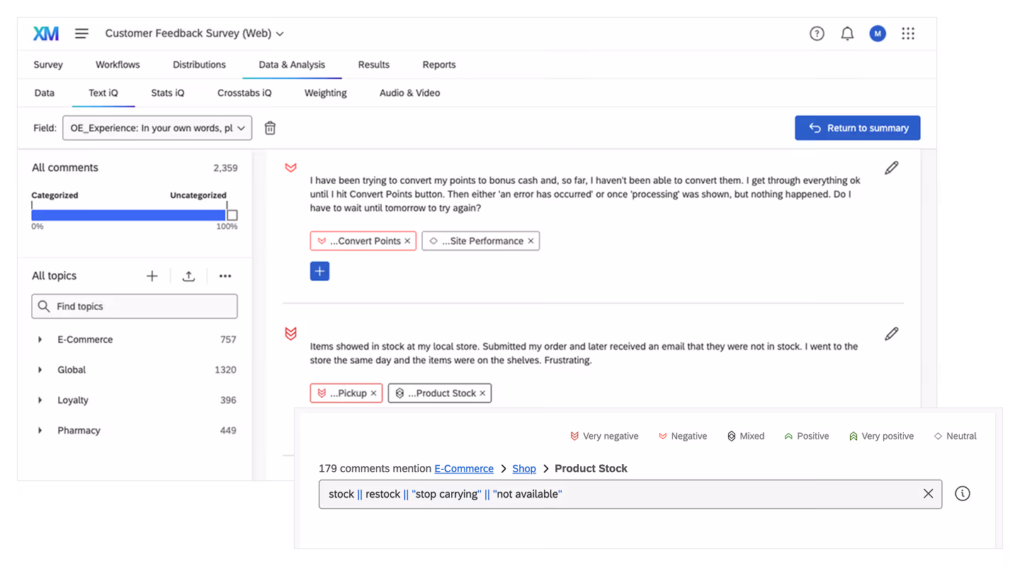
To speed up synthesizing open feedback, I created a taxonomy with over 70 topics that reflected the different areas of the business and trained an NLP model to auto-sort with precision.
Phase 2: Prioritize features
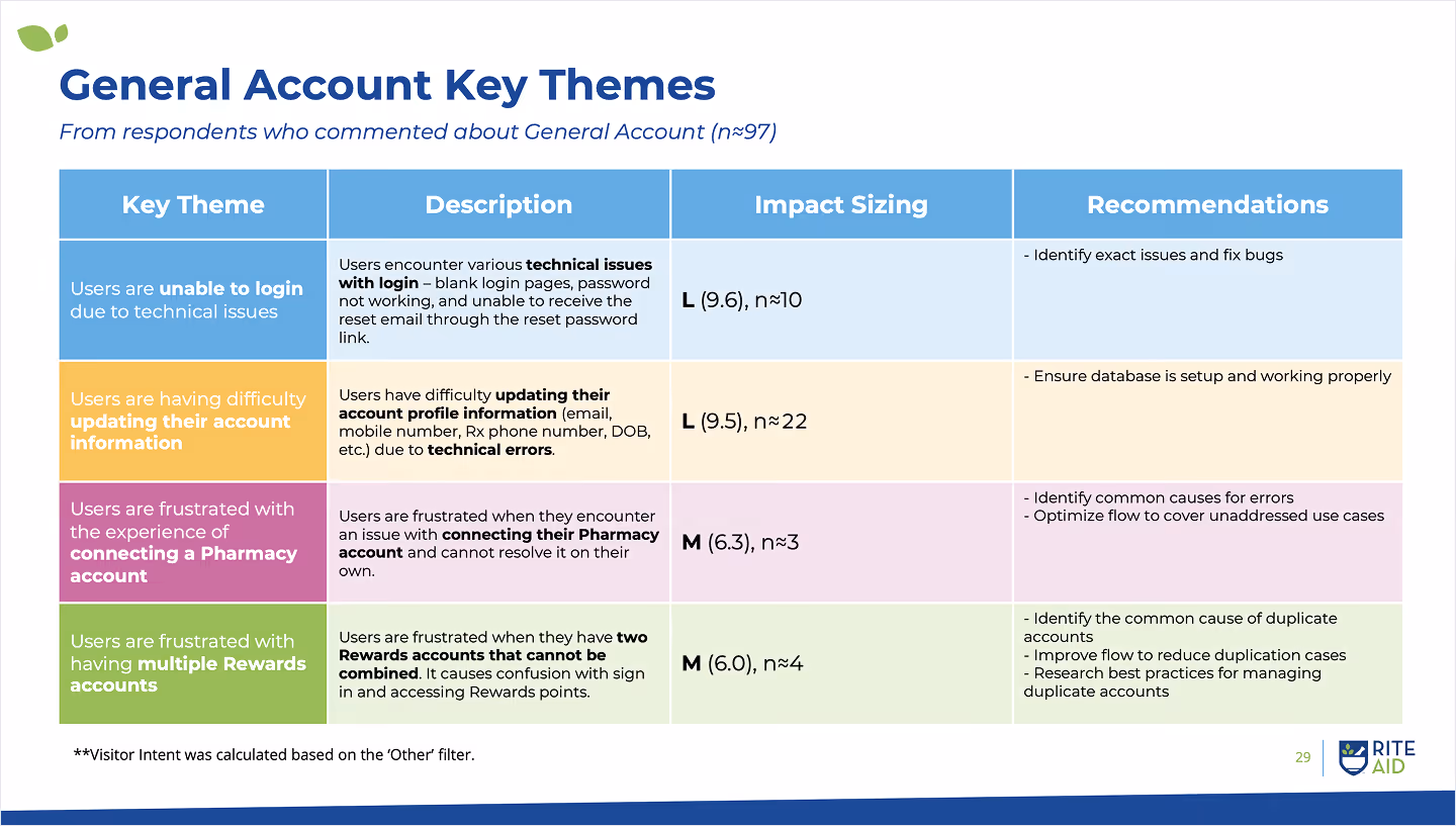
We put together a report of our findings to share key themes that we've heard from customers and to make recommendations on what features to improve on the site.
Phase 3: Launch & measure
The biggest challenge in redesigning account settings was working around legacy system limitations. Usability testing was key to validating hypotheses and guiding design decisions.
Outcome
To create lasting change, we embedded customer feedback into regular workflows by:
- Allocating time for discovery research and usability testing in project plans
- Introducing design QA (UAT) to ensure what was built matched the design
- Documenting processes to make customer-facing internal operations more transparent
Learnings
- Connecting insights to impact: I learned that turning qualitative feedback into action required tying it to measurable business impact. Leadership acted when user voices were reinforced with hard data.
- Leading with reassurance: I learned that responding to mistakes with support built trust and encouraged growth, which strengthened my leadership and fostered a more collaborative team culture.